How to Create an Author Website 101 - Part 2
What even is "author branding", and the simplest (and cheapest) ways to get an author website up and running
Hello hello everyone!
Welcome back to my series, HOW TO CREATE AN AUTHOR WEBSITE 101.
If you haven’t yet, take a look at Part 1!
Now, we’re moving on to Part 2:
Determining if you need an author website and what goes on it (features author website examples!)
Author branding and the lowest-cost platforms to build a site on (this post!)
Ways to build more complex author websites, including online shops and more
All about Newsletters
What is SEO, why it matters, and how to be Google searchable
Series topics are subject to change!!
Some quick credentials and disclaimers before I dive on in! My day job is as a digital product designer, I’m a freelance web designer on the side, and an author. You can check out my own author website here. All of these are my completely own opinions!
Another note: I do NOT receive any commissions from these website platforms, nor am I sponsored to mention these in any way. It would be cool if they paid me, but alas.
And finally, a MASSIVE DISCLAIMER: all of my opinions are purely for fiction authors. Nonfiction is an entirely different ballgame and incredibly dependent on your niche/subject/topic/etc.
Getting Your Sh*t Together
Before you dive into selecting a platform and building, it’s really helpful to pull all of your content together and quickly plan out what you want to accomplish. It is a LOT easier to build a website when you already have an idea of what want - attempting to learn how to navigate the website builder PLUS make something look good can truly break your brain!
The first step is nail down what you want to include on your website and have that content handy. Ideally, somewhere easy to copy and paste. In my last post of this series, I talked about what you should include on your site, depending on what stage of your publication journey you’re at.
This doesn’t have to be anything fancy, either - a quick note will do! For example, if you’re an author that just announced a traditional publishing book deal, your site may have the following pages with the subsequent information on them:
HOMEPAGE
Quick intro to the site (e.g., Lenora Woods - Fantasy & Romance Author)
Book cover, quick blurb, release date, preorder button, more information button
Newsletter sign-up
Full-length author bio and headshot
Contact Form with agent’s information
BOOKS
Book cover, full jacket copy, multiple pre-order links with different retailers, link to add on Goodreads and Storygraph
If it’s a series, maybe a teaser section about the next book (if it’s announced!)
Newsletter sign-up
ABOUT
Full-length author bio and headshot, option to download your headshot, photographer copyright credit
Newsletter sign-up
CONTACT
Full contact form and agent information
You might notice some of this information overlaps. That’s good and okay! Sometimes, people will come to your site for a very specific purpose - for example, maybe an editorial assistant at your publisher needs to grab your author bio and headshot for an upcoming event. They won’t want to scroll down on the page and see it, they’ll go to your site menu and click “ABOUT”. On the other hand, a reader could check out your website if they’re curious about your books, and simply scroll your homepage. You want all of your bases covered!
And in another example, if you’re a querying author that wants to establish a shorter-term, simpler website, your outline might be as simple as:
HOMEPAGE
Quick intro to the site
Querying book mood board, short pitch or “meat” of your query letter, and comp titles
Works in Progress (with mood board, pitch, comps, and status)
Author Bio
Email icon and social media handles (instead of setting up a contact form)
Everything on one page!
The next step is to figure out your author branding. I don’t mean simply what genre you write in; your branding extends to the visual identity of your website.
Ideally, you want this to stay CONSISTENT. Your Instagram posts should match your website vibe; your website vibes should match your book’s vibes. For example, if I wrote heartwarming, swoon-worthy contemporary romance, my existing branding wouldn’t be a great fit.
Your author visual brand includes the following components:
Color palette
Font choices (both for headers and body text)
Stock images to set the tone
Logo (optional)
If you’ve ever made a mood board for one of your WIPs - it’s similar!
An example - this is my author brand mood board that I made before I built my website, and here is my Instagram feed now!
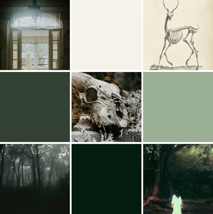
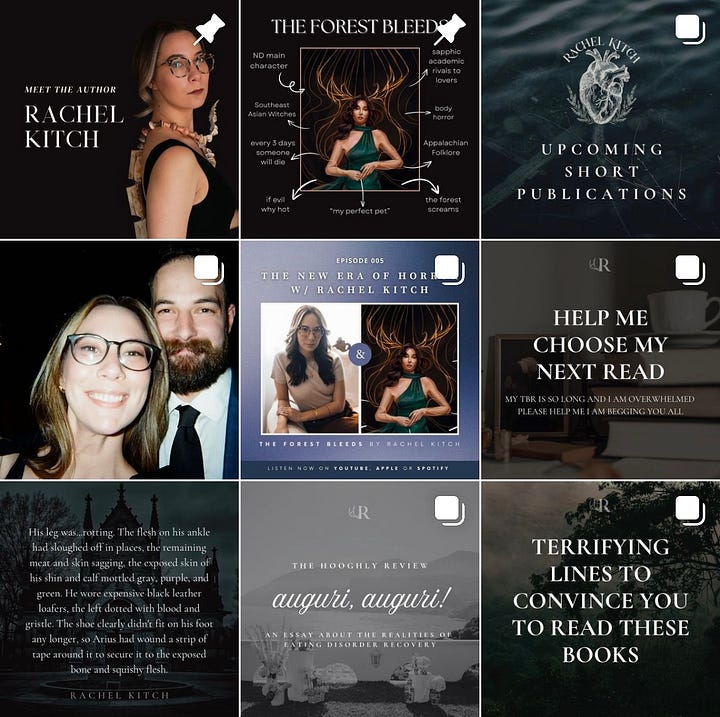
As you can see, it’s not a 1:1 match, but I try to keep the vibe consistent.
Kath Richards is an author that does an amazing job with her branding. Between her author website and her Instagram, she’s got an incredibly strong visual presence.
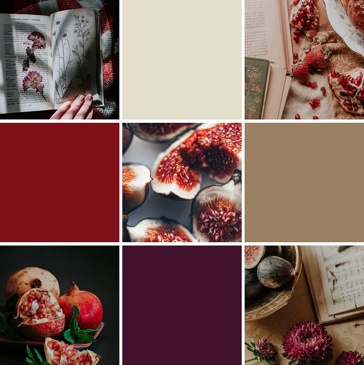
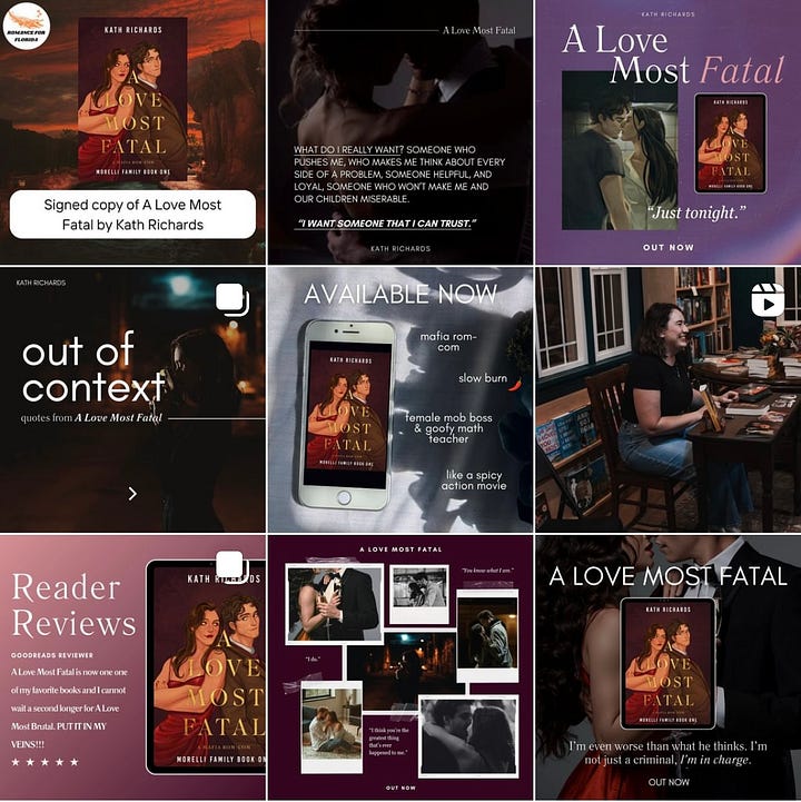
Keep in mind when choosing your colors - make sure your colors are readable against each other, and you’ve got at least 2 pairs of matching color “sets”! For example, when creating Kath and I’s color palettes, I double-checked that these colors worked together and I could have both light and dark colored backgrounds.
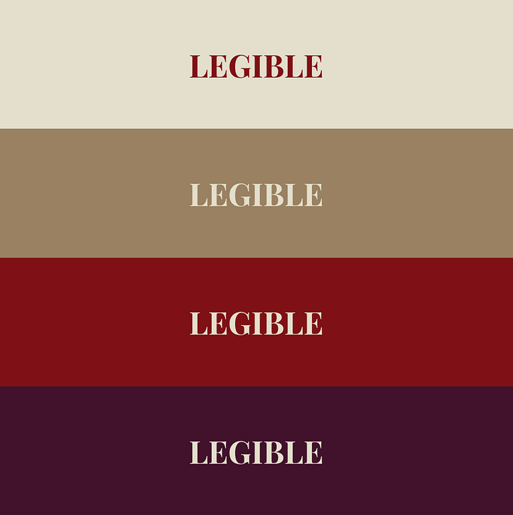
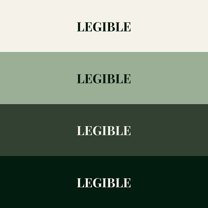
Another key step is choosing your author brand and website’s typography, or the fonts that you’ll be using. The key part here is to make sure you choose a font (or fonts) that is READABLE!
I’m about to sound really, really old. BUT. Avoid using the beautiful, swirly calligraphy fonts on your websites (go nuts on your Canva designs if you want). They’re difficult to read for larger chunks of text!
Your font choices should, again, match the vibe of the mood board you’ve created.
In this screenshot from my website, you can see that I’ve got 2 different fonts. A serif font (Cormorant Infant) for the titles, and a sans serif (Libre Franklin) for the body.
This Canva template can help you pull all of your color, imagery, and font choices into one spot!
I highly recommend figuring out what you want your author website to do and laying out your content before diving in and starting to build. It’s incredibly annoying to spend hours and hours figuring out a site builder, then realizing it won’t actually do what you want it to do. It’s also a LOT easier to build the site when you already have a skeleton in mind (and this is how we design and build sites in the industry!).
Now that you know what pages and content you want, and have defined your author brand, it’s time to start thinking about what website builder is right for you.
Terms I’ll Be Throwing Around
Domain - a domain is the website address that someone types into their web browser to get to your website.
Hosting - this is the platform that enables your website to live and function.
Domain and hosting are separate! A domain can be purchased through providers like Squarespace, GoDaddy, and BlueHost. Any hosting platform, which is what I’m about to go into more detail, can connect to a domain purchased through any provider. Some platforms offer the option to host your site and purchase a domain, like Squarespace. There’s pros and cons to this, which I may/may not discuss later.
Responsiveness - this refers to how easily a website can go from a laptop size to a phone size. If you’ve ever made your browser window really narrow, you’ll notice that the contents of the website shift around to accommodate it.
Code Embeds - the word “coding” is scary. I know. I don’t like it either. However, if you want more advanced options for your site (like a newsletter or an online store), it’s generally as simple as copying and pasting something from one place to another. An example - on my website, I have my substack sign-up right on the page. You can enter your email on my website, press a button, and you’re signed up! To do that, I embedded code from my Substack by copying the code Substack provided, and adding it to an embed section on my website. I will have an entire post dedicated to newsletters, so if you’re interested, stay tuned!
Important Things to Consider For When Choosing Your Platform
Is it easy to make my website mobile friendly?
Am I looking to create a short-term website, just for the time being, or will I be sticking with this for the next couple of years?
Am I able to build the features I want, based on my plan?
How much does it cost?
SPOILER ALERT: If you want to build a website that’ll stay with you for the long haul, stop reading now and wait for the next installment to come out. I wouldn’t recommend any of these sites for the long run.
Now, because I know you’re probably thinking “Rachel, oh my god FINALLY can you actually teach me something about websites” - let’s get into the nitty gritty!
Low-Cost Options for BASIC Sites
These are common platforms for low-cost web builders. If you’re only looking for a simple 1-page site, these may be good to try out!
NOTE - this is absolutely not an exhaustive list; these are the sites that I’m comfortable speaking on the pros/cons. There are always other options out there!
Linktree
Coming in at the simplest, most basic option - linktree!
Linktrees have sprung up everywhere because they’re super handy for your social media bio. All of your links in one place, meant for checking out content on your phone.
If you’re a short story author, a linktree can be a really great option. Established authors also use linktrees all the time to gather all of the preorder/order links for their books in one spot, so someone can easily buy their book from their social media profile!
However, you can’t display very much content on a linktree. It is literally a quick page with a collection of links. If you’re an author trying to query or sell your book - a linktree is great for your social media bios, but you’ll need a site that gives a bit more room for your information.
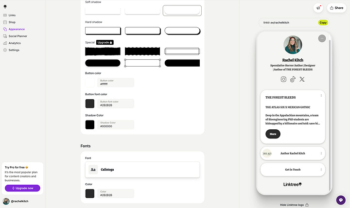
I was able to add a mini-bio and pitch for my book, but it gets cut off and you can’t add in any imagery.
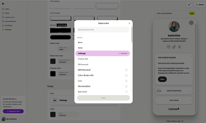
You can customize your fonts and color, but not by much without upgrading! They do have a good selection of themes to select from and you can make tweaks from there.
The Rundown:
Ease of use ✅
Customizable 🆗
Multiple pages ❌
Responsiveness ✅
Custom domain ❌
Code Embeds ❌
Contact Form ✅
Cost: Free for basic plan
Bio Sites
Bio Sites is another alternative to linktree that personally, I like a little more!
It’s the exact same concept, however I find it a bit easier to customize. A little biased, but I also vibe with the templates they offer a little more!
One of the big upsides is that you can add longer text elements to your site. Here, I was able to add both my full author bio and my book pitch to the site. I still can’t add static pictures, though.
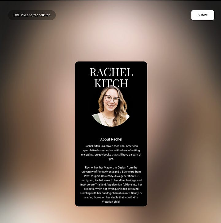
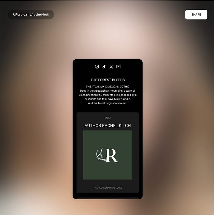
There’s lots of themes and font options, and Bio Sites is 100% free so you won’t have to upgrade to get access to a certain feature.
I personally like the different styling options you’ve got for your links, too, so it doesn’t necessarily have to look like a bunch of buttons clustered on a page. You can also customize the thumbnail image if you want to, or it’ll pull the sharing image from the link itself.
The Rundown:
Ease of use ✅
Customizable ✅
Multiple pages ❌
Responsiveness ✅
Custom domain ❌
Code Embeds ❌
Contact Form ❌
NOTE - you’re able to collect names and emails for a mailing list if you choose!
Cost: Free
Carrd
Carrd is a GREAT option if you’re simply looking for a easy and customizable site to hold your basic info: a brief bio, your book / WIP details, and ways to contact you.
Carrd also has a handful of free templates that look great on both desktop and mobile. It’s a super mobile-friendly platform.
The downside to Carrd is that it’s not the most… elegant interface, especially compared to others on the market. But it’s low-frills and does most of what you need!
I chose one of the “Sectioned” free templates to take a peek under the hood.
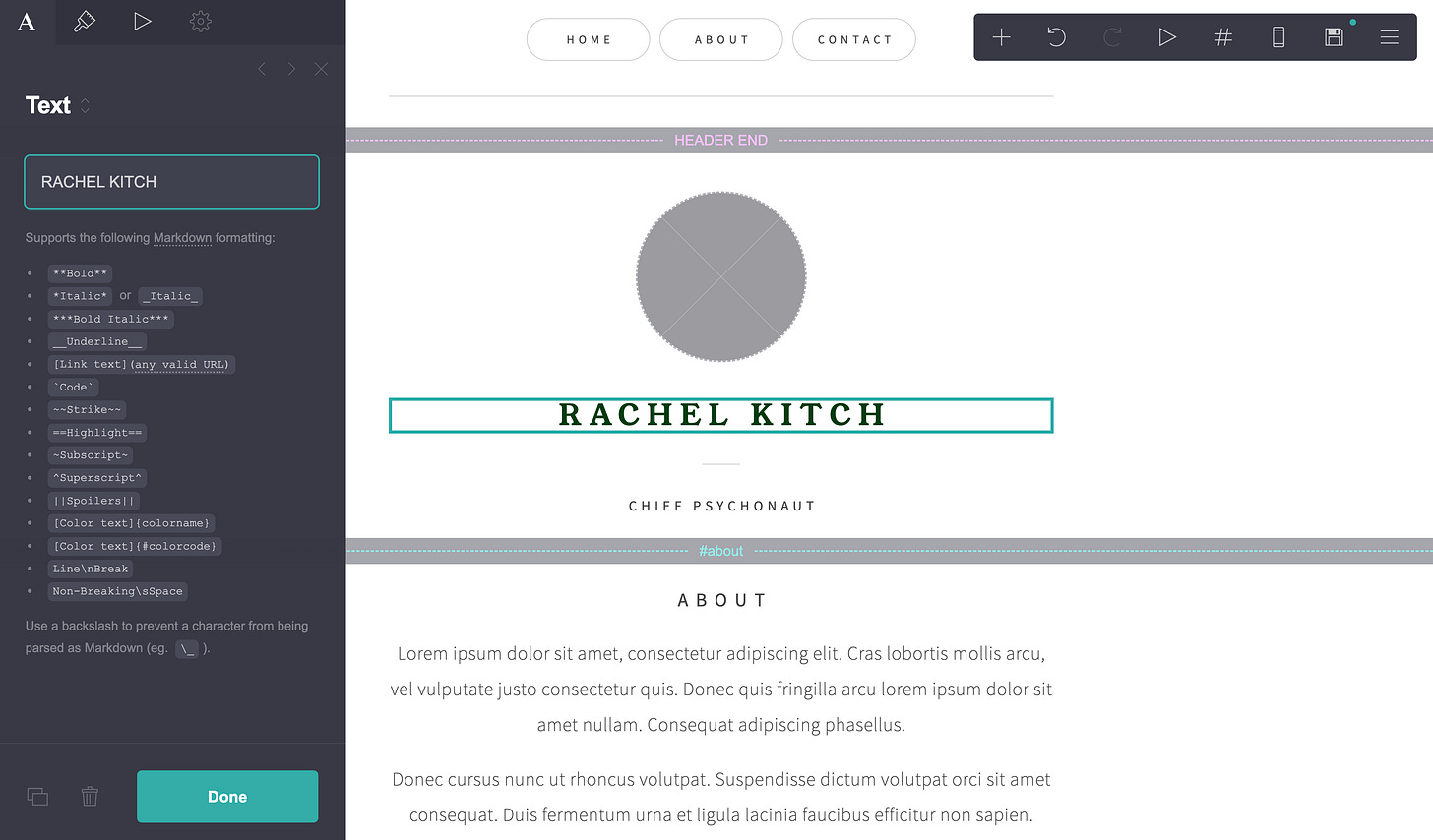
When I click onto a text box, it was a little confusing at first - just… IGNORE everything that looks like code on this panel, tbh! Other than that, it’s pretty simple to use. In the top left-hand corner, there’s icons that let you change certain aspects. The first icon, the one currently highlighted, lets you change the text.
The paintbrush icon lets you change the font, color, and size.
One really helpful thing that Carrd lets you do, that you can’t do on the previous builders I went over, is creating “Styles” for your text. It’s basically a shortcut to let you change different things to the same size/color/font/etc.
To the right of appearance, there’s a drop-down that says (none). If you click it, it gives you the option to Add a Style.
I created a header style, so if I wanted “About” and “Contact” to look the exact same as “Rachel Kitch”, all I have to do is click on those boxes, click the drop-down next to Appearance, and select Header.
You can also update a style after you’ve created it, and if you do, all places that have that style will automatically update as well.
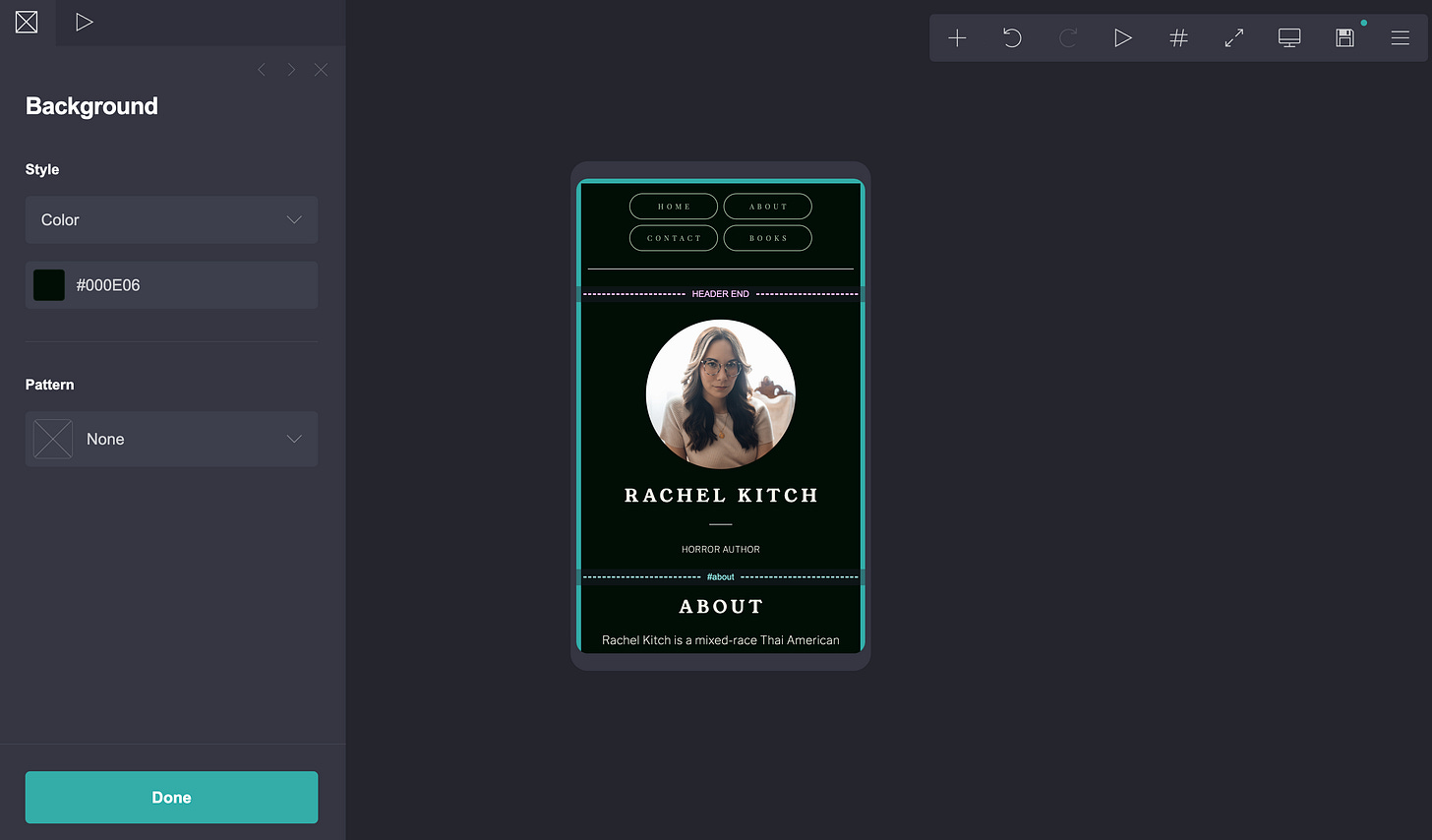
You’re able to change the background color under page settings! Plus, I can toggle between desktop and mobile view using the phone/computer icon in the top right-hand corner.
In the first screenshot, the top of the page had different buttons that would take you to different parts of the page. The template comes with “Home”, “About”, and “Contact”. I wanted to add another section to contain information about my books.
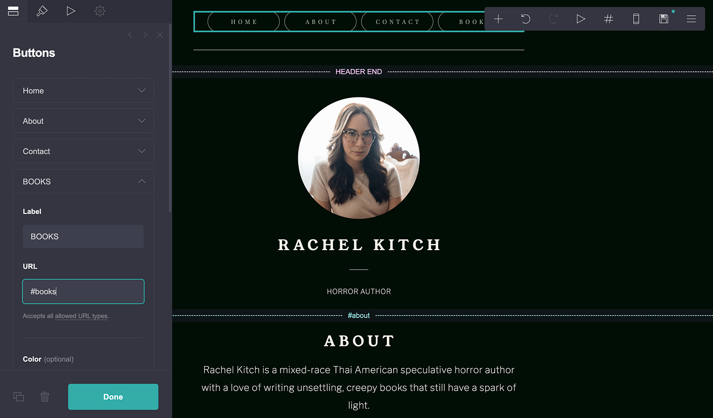
There are little dashed lines with #s across the page - those demarcate the sections of your site. To make a “Books” section, I just duplicated one of those line breaks (using the rectangle icons in the bottom left-hand corner, to the left of the trash can) and dragged and dropped it into place, then duplicated other elements on the page (like a header and an image) and dragged those into the section.
Now I want to add “Books” to the top of the page, so I clicked on the top section and added another button, then set the URL to be the same as what’s contained in the section break line (in this instance, #books).
One advantage that Carrd has is the ability to add in images in sections, making it a good fit if you want to include character art or a moodboard for your book.
Finally, Carrd is one of the cheapest site options. Most of the features you need as a short story, querying or on-sub author are completely free. You can upgrade to Premium for $19/year, and the biggest benefit is getting to connect a custom domain (so it won’t be like rachelkitchauthor.carrd.co).
Plus, if you want to run a newsletter - Carrd premium can also do that! It can connect to most of the popular newsletter sites (like Mailchimp or MailerLite), or you can add in a custom embed (such as Substack).
The Rundown:
Ease of use 🆗
Customizable ✅
Multiple pages ❌
Responsiveness ✅
Custom domain ✅ (with premium)
Code Embeds ✅ (with premium)
Contact Form ✅ (with premium)
Cost: Free, and upgrade to premium for $19/year
Google Sites
Google sites is the ultimate no-frills option. It’s completely free, and you have the ability to purchase a domain name and connect it to the site (again, for free, so you only pay for the domain name).
However, when I say it’s no-frills, it’s really no-frills. The template options aren’t very robust (or cute), and there’s not a ton of stuff you can customize or add. It’s also not the easiest interface to use; I had a bit of trouble customizing the colors for the site, and you can’t customize individual colors on sections. If you want to add a contact form, the only option is to create a separate Google form and embed that on your site. The upside is that if you’re familiar with the Google suite of products, it’ll be fairly similar for you!
The biggest downside is that it’s not super mobile-friendly. At least from what I could see, there wasn’t a way to design the site while in mobile-view mode. You can preview a site in mobile mode, and all of their pre-built components will automatically resize to mobile, but if you make any tweaks it’s not easy to figure out it’s not working on mobile.
The Rundown:
Ease of use 🆗
Customizable ❌
Multiple pages ✅
Responsiveness 🆗
Custom domain ✅
Code Embeds ✅
Contact Form ❌
Cost: Free
Canva
Personally, I adore Canva. My day job is as a designer, I’m skilled and very familiar with the Adobe suite, and I still default to Canva for a lot of things (moodboards, instagram pics, and the like).
However, there are a few things I strongly recommend you don’t do in Canva. Websites are one of them.
Canva does a lot of things well, and those strengths extend to its website builder. It has a wonderful assortment of templates available for use!
Once you’ve selected a template, the editing experience is almost identical to what you’re used to on Canva!
For example, it was pretty easy for me to start swapping out elements. But the downside here - creating a website has different requirements than creating a graphic design, so it took me a while to figure out some basic website things.
For example: a button! To make a button, you can create a shape and then turn it into a link. When you click on a rectangle, 2 toolbars will appear. The closest to your cursor will have icons like a comment, a lock, a trashcan, etc. Click the three dots icon, and another menu will appear. You want to add a link to the shape so it becomes a button! It can go anywhere - an external site, or take you somewhere else on the page.
Another upside is that you can do a LOT of fun designs!
However - here’s Canva’s biggest weakness. I wanted to try out this fun and funky layout that I couldn’t do in any of the options. Canva’s editing experience is identical to making a graphic design, so I can put anything anywhere, use effects, and more.
Looks great like this! (If it doesn’t, let me live, I’m proving a point ok?)
However, Canva doesn’t let you edit in a mobile view, and since I strayed away from the template, Canva doesn’t know what to do on mobile…
:(
In my opinion, this is the WORST part about Canva websites. The moment you start customizing, you run the risk of it not looking good on mobile, and there’s no way to tell until you’re actually done designing and preview it.
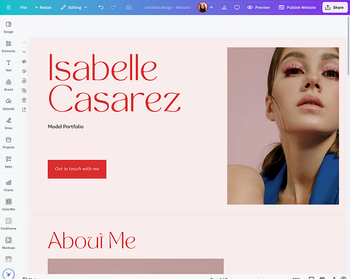
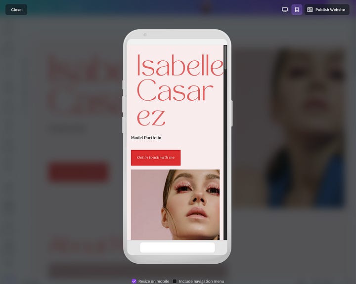
Even their standard templates, not customized at all, run into this issue. A vast majority of people looking at your website are going to be on their phones, which makes their lack of responsiveness a huge downside.
There’s also not options for embedding code or adding a contact form, which makes it a little limited as to what you can do!
The Rundown:
Ease of use ✅
Customizable ✅
Multiple pages ❌
Responsiveness ❌
Custom domain ✅
Code Embeds ❌
Contact Form ❌
Cost: Free (to connect a custom domain, you do need Canva Pro, $15/month)
Wordpress
If you’re thinking about a slightly more robust option, Wordpress definitely comes to mind! It’s more all-encompassing than the other platforms I’ve discussed in this post, but still cheaper than other platforms.
And Wordpress does some great things! It was originally built to be a blogging website, so if you’re interested in writing blog posts (AND notifying subscribers when a new post is available!) Wordpress has everything packaged in one place.
Wordpress includes a lot of template options as well!
One of the downsides, though, is in their “site creation” process, you can’t actually fully preview the templates, which is important. (More on that in a bit.)
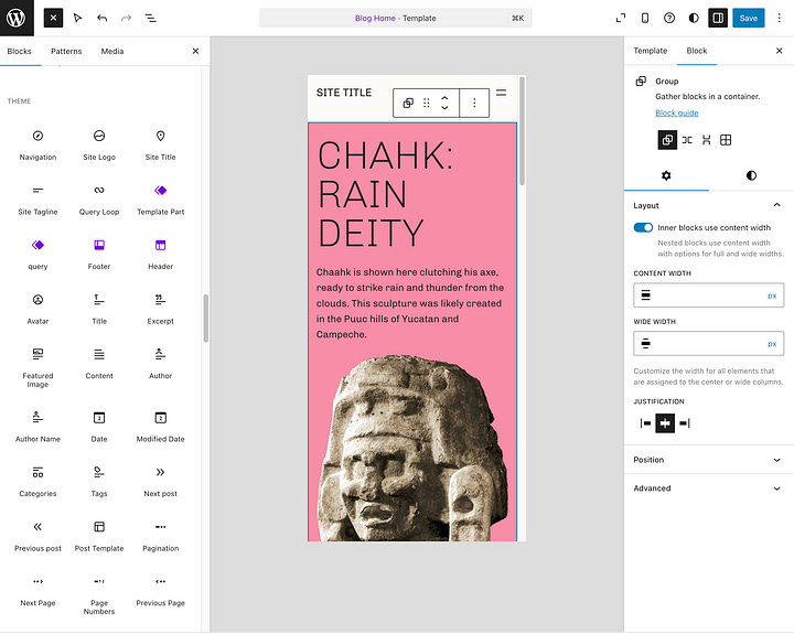
After your template is selected, you can start customizing! On the right-hand panel, you can customize your elements, like font size, color, etc.
A note here - Wordpress really buries a lot of options. It took me a minute to figure out how to change the text. By default, you can change the text color and background, font size, and the dimensions. But I wanted to change the font itself! To do so, click the little three dot icon next to the “category” (ie Color, Typography, Dimensions), and you’ll get a new menu.
Wordpress uses a “block” based system for adding and editing elements on your site. To add a new component, such as an image or a contact form, you can click the Plus sign (either top left hand corner or wherever your mouse is) and insert a new block.
Wordpress has a ton of built-in elements, too - if you browse all, then select “patterns”, there’s a lot of bigger sections that you can drag and drag in (like testimonials, contact forms, etc)
Wordpress is also mobile friendly - you can design using both the desktop and mobile views, preview in different devices, and Wordpress does a pretty good job of automatically adapting the designs between the two screen sizes.
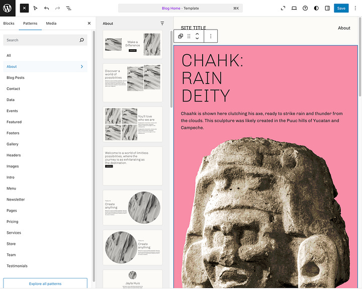
Wordpress is also the only option in this post that allows you to have multiple pages in your site - meaning you can have a Homepage, a Books page, an About Me page, and a Blog page. When you click the Wordpress logo in the top left-hand corner, you enter this “Design” mode, where you can update more site-level settings. This is where you can add a new page.
And THIS is where the template thing I mentioned earlier comes back with a vengeance. In Wordpress, everything is defined by the template you choose - not just the homepage, but every subsequent page as well. Your site’s template includes designs for different “type” of pages. In Wordpress, they assume you’re probably creating a blog, so every template tends to be more blog-focused than you may want (and this is especially true in the templates in the “authors and writing” section).
If you can see in the image above, most of these templates are specifically for a blog website. There’s only one option for a blank “page” - but for some reason, it doesn’t include the same site navigation (the panel on the left hand side that lets you move between the site’s pages).
The big issue is that when you create a new page, you’re not given the option to select a template, nor can you change the template for that page once you make it. It’s very possible I’m missing something, but I spent a very long time trying to figure this out and couldn’t make sense of it.
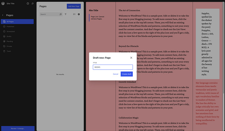
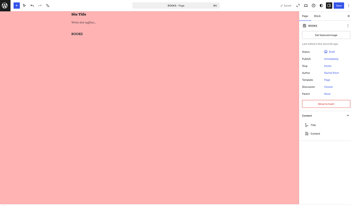
I tried editing the “Page” template but still couldn’t figure out how to get the navigation back on.
Unfortunately, I find Wordpress one of the hardest platforms to build on. Anecdotally, I volunteer for a nonprofit that helps progressive candidates for state and local offices in swing states with their digital presence. Our nonprofit’s template is hosted on Wordpress. Even with a defined template, custom-built to easily create a political candidate website, on every campaign volunteer team we still had to have a designer and an engineer (aka someone who codes). I have definitely broken a sweat fighting for my absolute life on Wordpress (case in point: I broke a sweat just getting all of the screenshots for this post).
Wordpress starts at $4/month for their “Personal” plan, $8/month for their “Premium” plan. Personally, I’d recommend forking over the extra $4/month to bump up to their Premium plan. Why?
In quite possibly the most annoying move ever, the Free plan doesn’t let you change colors across your entire site. You have to change every single section if you don’t like the theme’s color palette or font.
The Rundown:
Ease of use ❌
Customizable 🆗
Multiple pages ✅
Responsiveness ✅
Custom domain ✅
Code Embeds ✅
Contact Form ✅
Cost: Starts at $4/month for their “Personal” plan, $8/month for their “Premium” plan
This is also far too niche for the average person reading this, but Wordpress, very specifically the CEO, has been making quite the stir in design/tech world. There’s currently a subreddit called r/WPDrama if that gives you any indication. The CEO has already been rumored to have tried to pay Kendrick Lamar $500K for a diss track. If you want the scoop, DM me because I love to gossip about ridiculous tech billionaires.
Wix
Wix is an Israeli-owned site and is headquartered in Israel. Given the current genocide against Palestine, I cannot in good faith ever recommend Wix, nor will I promote their product in any way.
If you currently have a Wix domain or site, and you’d like to change off of Wix, please DM me and I will help you for free. This company should not receive your business.
The tl;dr
That was a lot of information! A very long post! If I could sum up and give my personal, biased recommendations:
If you’re querying or on sub, and comfortable with a simple temporary site, my recommendation is Carrd. It’s really cheap for the premium plan ($19/year!), you can connect a custom domain and get rid of the Carrd branding, and it’s easy to use. It comes with everything you need, shy of selling a book: you can add different sections with images and buttons, a contact form, even embed a newsletter if you already have one.
If you’re a short story writer, biosite is another great option. I love the ways you can customize the different links, you can include text-only sections to feature your author bio, and it even includes a contact form!
If you’ve sold a book, either indie or trad, wait for next week’s post! You’re going to need a lot more information on your author site that none of these builders can do.
Now what?
Thanks so much for tuning into part 2 of my “How to Create an Author Website 101” series. In the next installment, I’ll go over options for more complex author websites!
P.S. if there’s a topic that you want to learn more about (in the world of author online presence) that isn’t covered in the outline at the beginning of the post, let me know! I’m happy to extend this series as necessary!





Hi. Is the next part not out yet?
Would you ever recommend just linking your domain here directly to Substack?